Design TO Festival
Identity Re-design, Communication Design
Duration
︎︎︎ September - December 2020
Tools
︎︎︎ Illustrator, Indesign, Photoshop
Duration
︎︎︎ September - December 2020
Tools
︎︎︎ Illustrator, Indesign, Photoshop
Project Overview
The Toronto Design Festival is an annual event that celebrates design as a multidisciplinary form of thinking and making through 100+ events and exhibitions. The challenge is to redesign an visual identity for the festival and apply it consistently through both print and digital platforms. Deliverables should include English and French, giving equal treatment to both.
The Redesign ︎︎︎
Expressing the multidisciplinary mediums through the use of simplified icons and colours.

Phase 01: Festival Research ︎︎︎
To understand the company’s mission, values and previous visual systems.
Initial Research
Before designing, research was gathered to understand the company’s overall identity and message.
Initial Festival Exploration
+ It brings awareness to the importance of creativity, community, and experimentation.
+ Target audience: Aged 18 to late 30s.
+ Open-minded, willing to try new things and learn.
+ Creative-spirited, values personal visual expression.
+ Adventurous, willing to walk around the city to view exhibitions and installations .
View Full Research
Initial Research
Before designing, research was gathered to understand the company’s overall identity and message.
View Full Research
Initial Festival Exploration
+ It brings awareness to the importance of creativity, community, and experimentation.
+ Target audience: Aged 18 to late 30s.
+ Open-minded, willing to try new things and learn.
+ Creative-spirited, values personal visual expression.
+ Adventurous, willing to walk around the city to view exhibitions and installations .
View Full Research
Phase 02: Visual Identity ︎︎︎
Developing a visual identity that is easily recognizable while staying true to the company’s message.
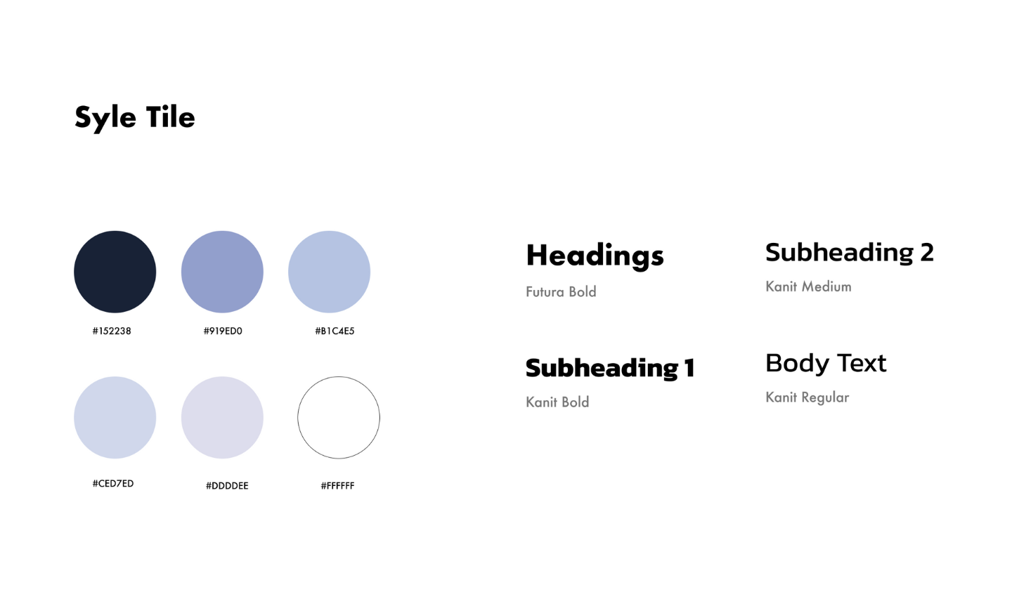
Visual Identity
The blue color palette portrays a calm yet imaginative state in viewers. It is a timeless color and can be used across both print and digital platforms seamlessly. The colors and grid-like background takes inspiration from the anatomy of blueprint paper, which is mainly used as a basis for planning and designing big ideas. For many designers, having a vision and executing a idea comes from a simple sketch. I wanted to emphasize this through the color palette and simple visual icons, which celebrate the different art forms at DesignTO.
Phase 03: Festival Materials ︎︎︎
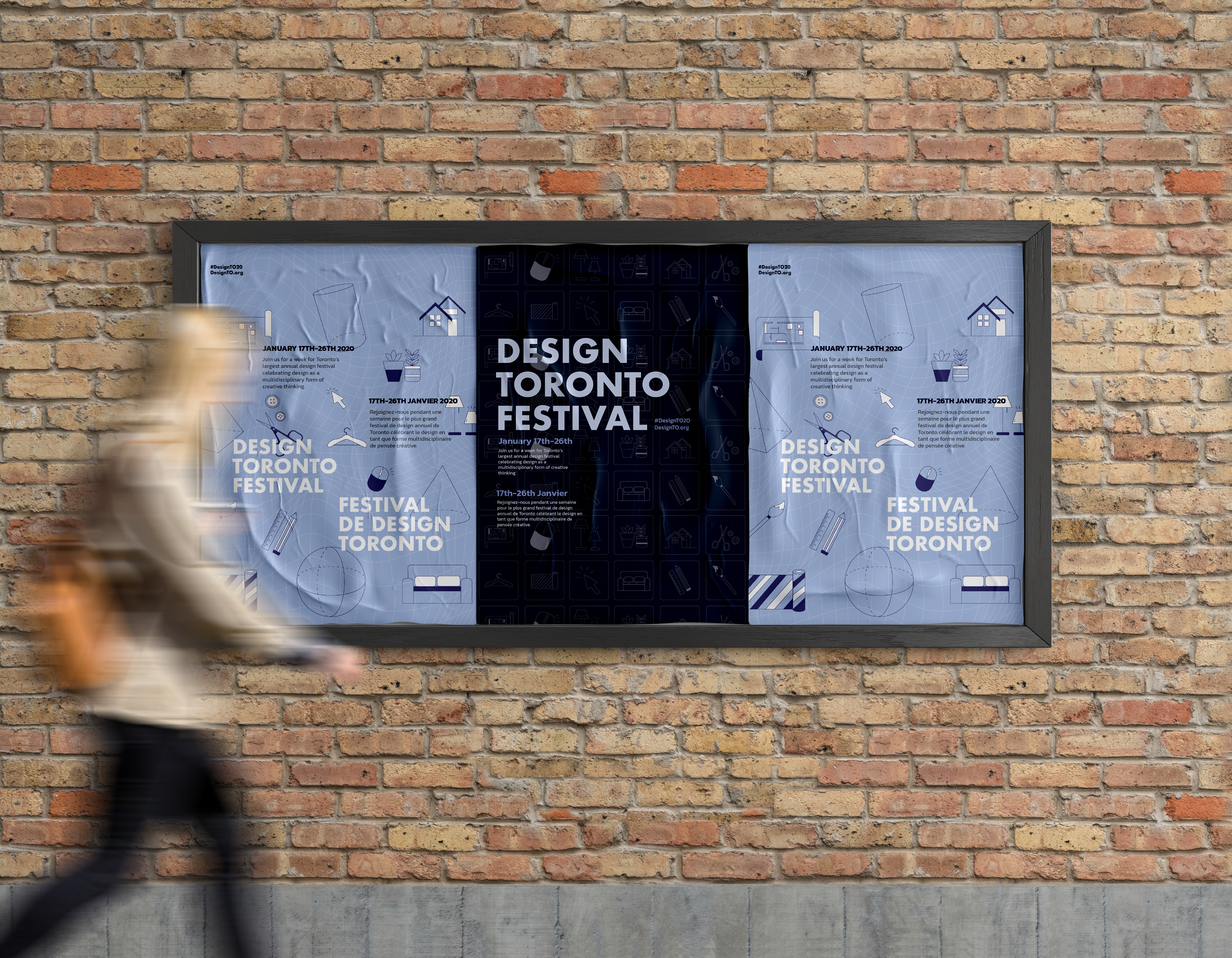
Festival materials including a poster, booklet and e-ticket which will help visitors navigate the event.
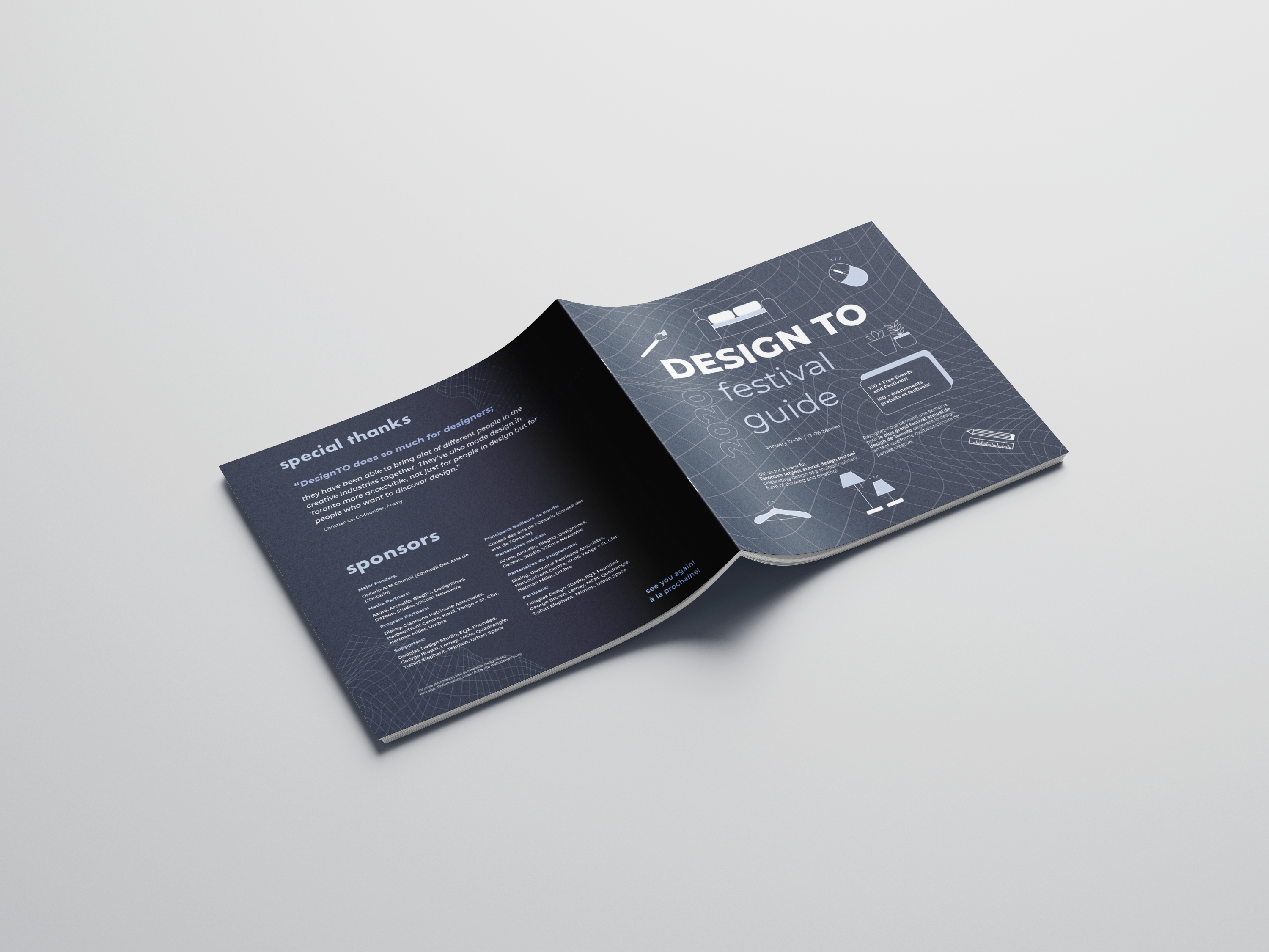
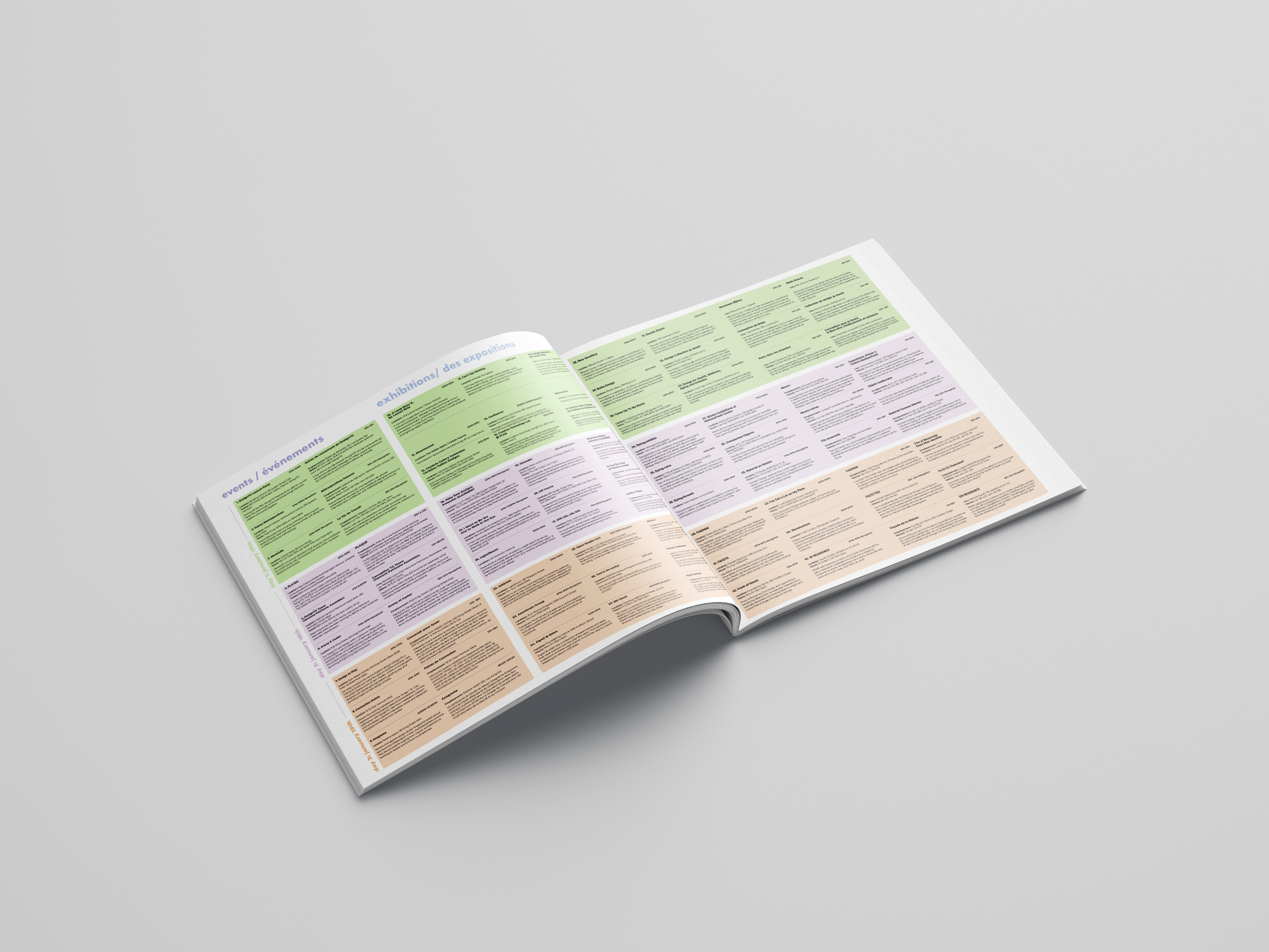
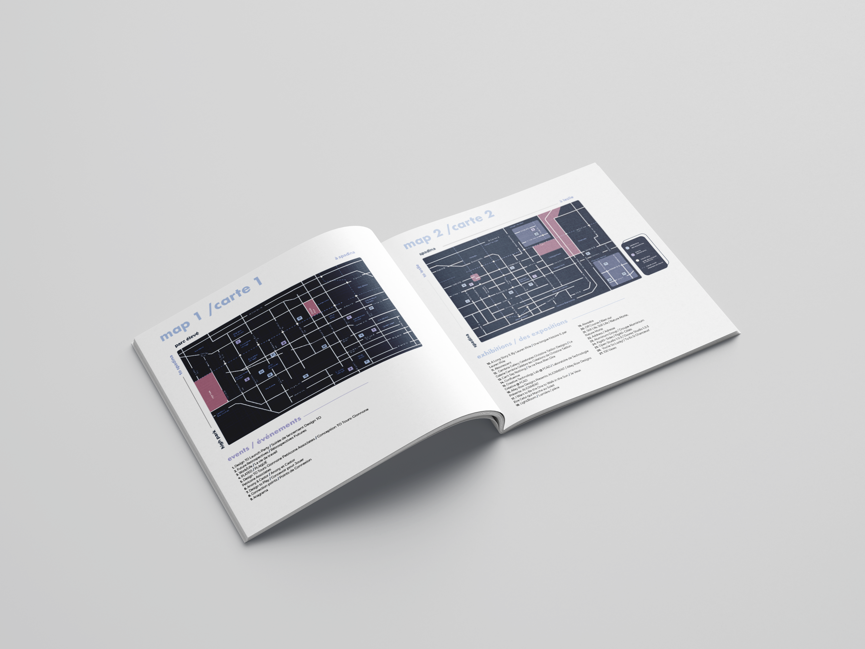
Festival Booklet
Designed to help visitors navigate different exhibitions and events located across Toronto. Included with a timetable, event list and map. This could also serve as a souvenir for visitors to remember the event from.
Festival Booklet
Designed to help visitors navigate different exhibitions and events located across Toronto. Included with a timetable, event list and map. This could also serve as a souvenir for visitors to remember the event from.


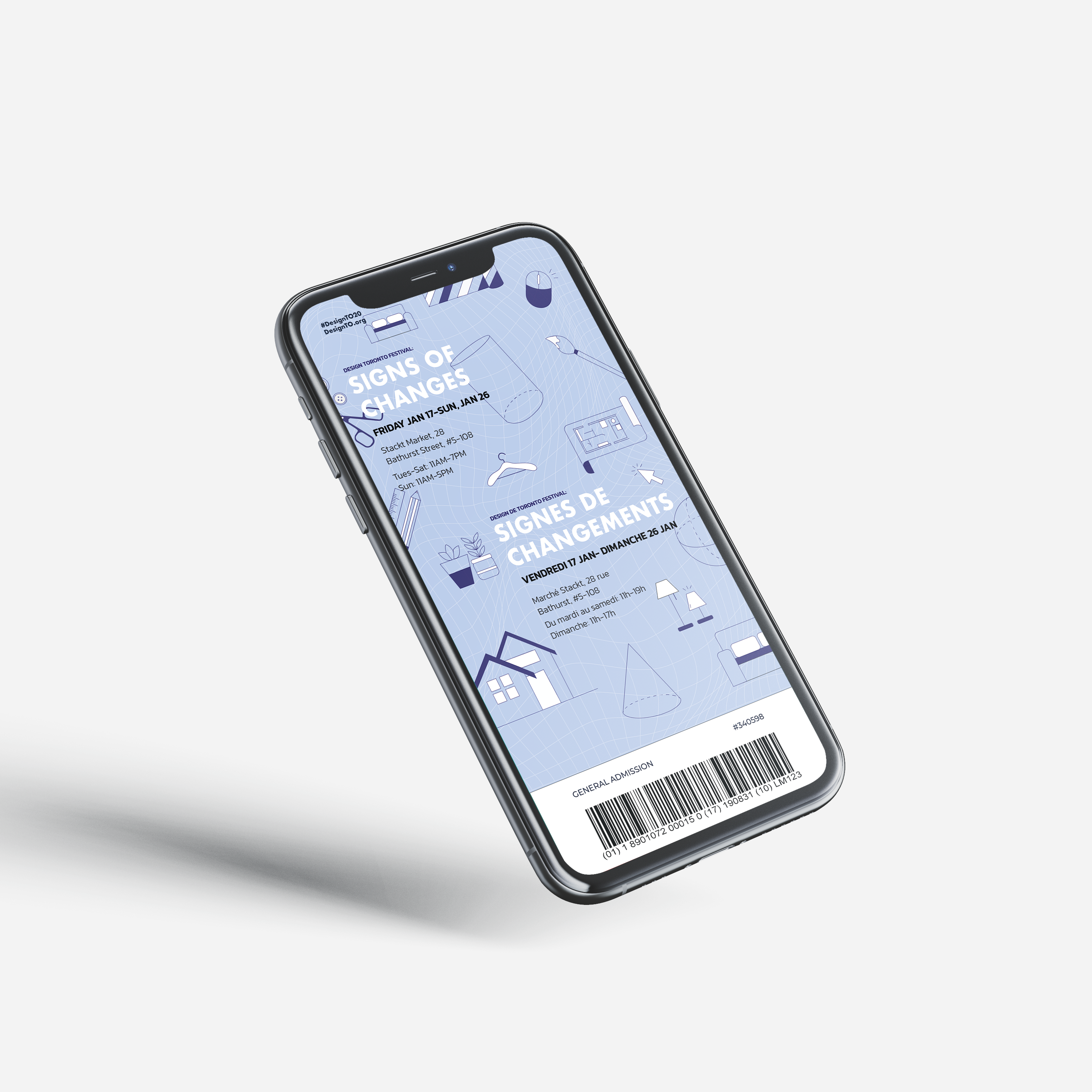
E-Ticket
Designed as a confirmation piece for events with a purchase of general admission. Follows the visual system shown through the large scale poster and printed booklet.
